Six Months.
Multiple Projects.
One Designer.
01. OVERVIEW
Dive into my six-month journey as a UX designer, where I navigated a fast-paced environment, managed multiple projects, and developed websites from the ground up. This case study showcases how I crafted user-centric solutions, optimized workflows, and applied technical expertise to overcome real-world challenges.
Note: Some details have been omitted for confidentiality, focusing on the work itself.

02. Role
Uncharted Territory
At just 13 years old, while in 7th grade, I wanted to do something different. Instead of following the usual path, I immersed myself in web design and development, eager to create and innovate. What started as curiosity quickly turned into a passion, driving me to explore the digital world and refine my skills.
Outcomes
- Leasing Data Project: Developed a business case that laid the groundwork for a game-changing feature in commercial real estate management.
- Charts and Tables Enhancement: Designed improvements to data visualization, making complex property data more accessible.
- Retail Experience: Proposed strategies to maintain momentum and ensure our retail experience remained a core offering.
- Process and Ways of Working: Delivered recommendations aimed at streamlining the design process for scalable growth.

03. Key Challenges
Chaos Meets Simplicity
Challenge
As the sole UX designer for the entire product, I juggled four projects simultaneously, balancing design strategy, user experience optimization, and seamless execution:
- Leasing Data Project
- Charts and Table Enhancement
- Retail Experience Enhancements
- Process and Ways of Working Recommendation
Each project had its own challenges, stakeholders, and tight deadlines. The pressure was on to deliver top-notch work across the board while getting up to speed with the commercial real estate industry.
Solution
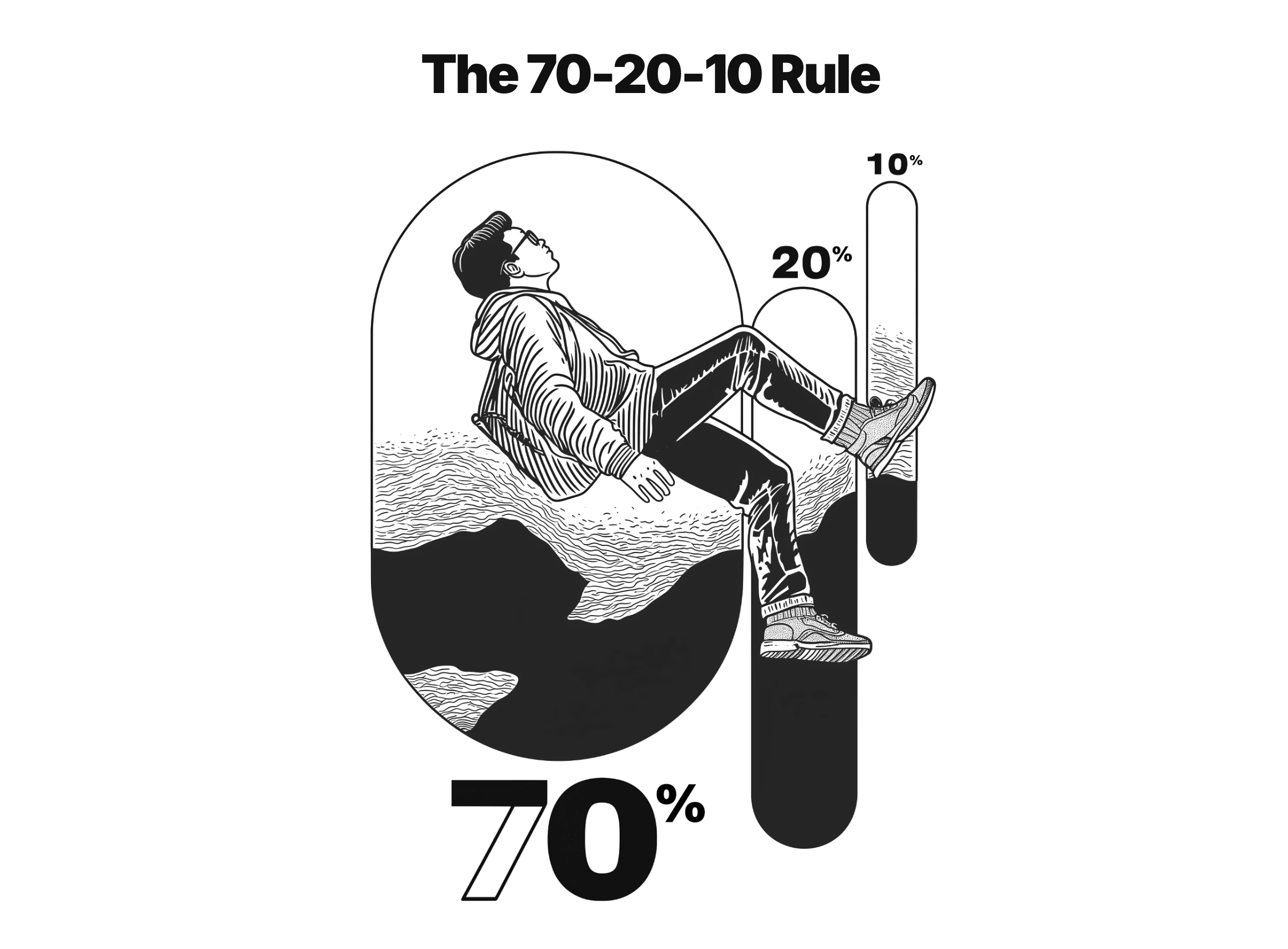
Realizing I needed a game plan to stay sane and productive, I turned to the 70-20-10 Rule to prioritize my efforts:
- 70% on the highest priority (Leasing Data Project)
- 20% on the second priority (Charts and Table Enhancement)
- 10% split between the remaining two (Retail Experience and Process Improvement)
This wasn't a rigid rule but gave me a solid framework to manage my time and energy effectively.
Weekly Breakdown
I structured my days around 90- to 120-minute deep work sessions, ensuring focused productivity. While unexpected challenges arose, I prioritized at least two dedicated blocks for high-impact tasks. The rest of my schedule remained flexible, allowing me to adapt to the evolving needs of each project.
- 4-6 hours: Deeep work high-priority tasks
- 2 hours: Work on the second priority
- 1 hour: Tertiary tasks
- Morning: Retail Experience and Process Improvement
- Afternoon: Plan for the next week and tie up loose ends
Monday-Thurday
Friday
Dealing with Reality
No week ever went exactly as planned. Here's how I handled the curveballs.
- Urgent Requests: I build in a buffer during afternoon sessions for any urgent issues. If something couldn't wait, it got slotted in here
- Shifting Priorities: If a project needed more attention, I'd adjust my 70-20-10 split and keep stakeholders in the loop.
- Energy Levels: I'd tackle high-energy tasks (like creative design work) when I was at my peak and saved less demanding tasks (like documentation) for when I needed a breather.
This system wasn't perfect, but it helped me keep all the plates spinning without losing focus. Flexibility within a structured framework was key.
05. UX DESIGN
No Scenic Route,
Just Speed
Solving core problems goes beyond development--it
starts with effective resource allocation. With a
fresh perspective, I identified key to process
improvements to accelerate the work.
Problem
- Resource Crumch: Being the lone designer, the workload was hefty. Designs often weren't fully fleshed out before hitting development, leaving developers without enough guidance.
- Design-Development Disconnect: The procces didn't facillitate smooth collaboration between design and development, leading to extra time spent on QA to fix overlooked gaps.
- Lack of Users Testing: Without formal reseach and testing, I risked building features that might miss that mark.
Solution
- Out-of-the-Box Efficiency: Rather than building everything from scratch, I started using off-the-shelf to cover about 70% of our needs immedietely.
- Design Tokens for Consistency: Proposed implementing desing tokens to unify desing and development, reducing rework and ensuring everything looks and feels cohesive.
- Rapid Prototyping and TestingBy leveraging existing solutions, I could quickly create prototypes and present them to customers sooner, enabling us to fine-features before launch.
Payoff
- Jumpstart Efficiency: Meeting 70% of our requirements upfront would mean starting each project with a running start.
- Focus on the Critical 30%: Freeeing up time to polish the customer experience where it really couted.
- Faster Discovery and Iteration: Early testing and feedback loops would help us spot new opportunities quicker.
UX Strategy
70% Boring
Our UX strategy centres on Jakob's Law, which states: "Users spend most of their time on other websites, so they expect your site to work like all the others they already know."
By mirroring design elements from popular websites and apps, we're aiming to make our users feel right at home. This approach taps into their existing mental models and learned behaviors, reducing cognitive load, smoothing out the learning curve, and boosting overall user satisfaction and efficiency.
30% Magic
In data visualization, it's often the small UI decisions that make all the difference. Elements like typography, spacing, and content play crucial roles in how users perceive and interpret data.
By honing in on these nuances, we can enhance the user experience and convey information more effectively.
Design Foundation
The Power of Boring
With no design resources and no room for deep-dive user research, I anorched my OX strategy Jakob's Law:users spend most of their time on other sites, so they expect yours to feel familiar.
Inspired by Youtube, the second most visited site in the world, I designed an experience with zero learning curve.This approach aims to minimise onboarding time and streamline future develpment by leveraging patterns users already know by heart.
06. CLOSING
Jorney Ends
This jouney was a test of adaptability and focus, pushing me to grow in unexpected ways. Here are some stadnout moments.
- Delivered Solo: Covered all projects requirements as the sole designer&developer across many major projects
- Sanity with 70-20-10: The 70-20-10 rule kept me organized. Dedicating 70% of my time to top priorities ensured deep focus without neglecting other responsibilities.
- Adapted Beyond Fintech: Quickly learned the nuances of commertial real estate to deliver effective design in a new industry.
Winning Moments
Lessons Learned
- Strategy and Details Matter: Balacing overarching strategies with UI details is crutial. I applied Jakob's Law for usability while fine-tuning typography to improve readability.
- Progress Within Costraints: Found ways to drive progress despite limited resources and fixed scope, like leveraging existing design systems to cut development time.
- Stay Flexible: Adjusted the 70-20-10 rule as project priorities shifted-for instance, rellocated at time when the Charts and Tables Enhancement became urgent.